
Squeezefunnels Theme has settings in Customize > General for both page layout (full width, boxed) and Content width, which controls the width of the content in the header and footer. In the content area of the page, Page Builder has both Global Settings and individual row settings for the width of the row's background and content. Here's how they all work together.
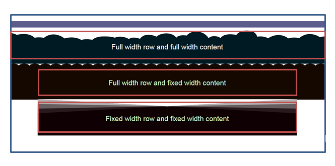
Boxed page layout example
A boxed layout means that the web page appears in a box in the browser, with space appearing around the box as your browser screen is sized larger than the box size. The box border is shown with a blue line in the screenshot below.
The theme sets the page layout and header/footer width
The boxed layout is set in the Squeezefunnels Theme's General Layout settings. In the screenshot above, Width = Boxed and Content width = 960 px. This sets the width of the header and footer content (in this example, the two columns in the top bar) at 960px. You don't have to enter the width of the box – it's automatically calculated by adding 80 px to the content width, which produces a buffer between the header/footer content and the box on both sides as the screen is resized.
Page Builder sets the row width
The screenshot above shows three different combinations of row and content width, set for each row in the layout.
- In the first row, Row is set to Full width. With a boxed layout, this means the row background stretches the full width of the box (not the full width of the browser).
Row content width is also set to Full width, which means the content also stretches the full width of the box, or less depending on the margins and padding you set for the row.
Both of these default settings are inherited from Tools > Global Settings, or you can change them for the individual row. - In the second row, Row width is set to Full width and fixed content width.
Max width of the fixed row content is set at 600 px. This setting comes from Tools > Global Settings and can't be changed in individual row settings. - In the third row, Row width is set to Fixed. This means the row background will only stretch to the Max Width specified in Tools > Global Settings.
Row content width is also set to Fixed, which means row content also has a max width of 600, or less depending on margins for the content.
Max width is set at 600 px. This setting comes from Tools > Global Settings. The default max width is 1100 px.
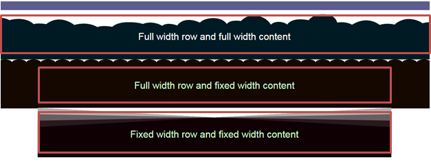
Full-width page layout
Below is a screenshot showing a full-width page layout with various combinations of row and row content settings. A full-width layout means there is no box, and the content is free to stretch from side to side to the edge of the browser window.
Theme Settings
The full-width layout is set in the Squeezefunnels Theme's General Layout settings. In this screenshot above, Width = Full Width and Content width = 960 px. This means that the width of the header and footer content is 960 px, but the header and footer backgrounds stretch to the edges of the browser window.
Page Builder Settings
The row and row content widths are set in the Page Builder Global Settings. When rows are set to full width, then content within the row can be set to either full or fixed width. The fixed width of the row is set by the max-width setting in the Page Builder Global Settings. With a full-width page layout, the row background extends all the way to the edge of the browser screen.