
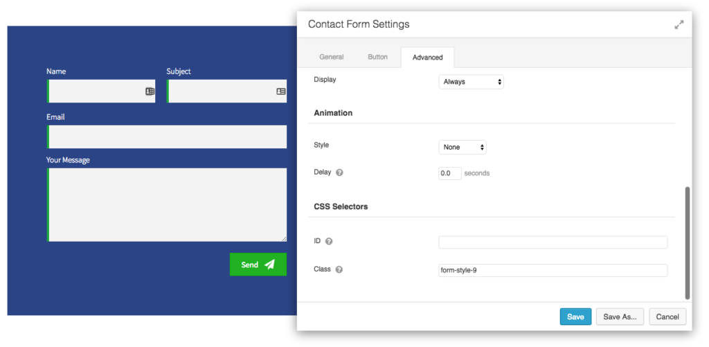
Here are 10 beautifully done contact forms which you can use for your next project. To use these styles, you will need to add a custom CSS class to the Contact Form module. Each form style has its own class.
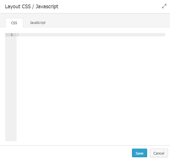
After adding the CSS Class, copy the CSS code and paste it under Tools > Layout CSS /Javascript > CSS Tab.
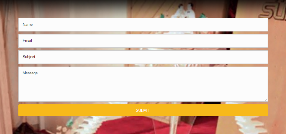
1. Elegant Grey
A standard form design with a red submit button. You can mix and match this with almost any kind of website. Just change the color of button from module settings to match your site’s branding. Custom CSS Class for this style is form-style-1
.form-style-1 {
    background: #eee;
    padding: 30px;
}
.form-style-1 .fl-input-group input,
.form-style-1 .fl-input-group textarea {
    border-radius: 0;
    padding: 12px;
    height: auto;
    background: #fff;
    color: #ddd;
    border: 1px solid #ddd;
}

.form-style-1 .fl-input-group input::-webkit-input-placeholder {
    color: #ddd;
}
.form-style-1 .fl-input-group textarea::-webkit-input-placeholder {
    color: #ddd;
}

.form-style-1 .fl-input-group input:focus,
.form-style-1 .fl-input-group textarea:focus {
    border: 1px solid #ca2f2f;
}

.form-style-1 .fl-input-group {
    margin-bottom: 20px;
}
.form-style-1 label {
    text-transform: uppercase;
    font-weight: 400;
    font-size: 14px;
    margin-bottom: 0px;
}
2. Evergreen Green
Building a website for Health, Nutrition, Charity? This may be the perfect fit for a high contrast contact form. Custom CSS class for this style is form-style-2
.form-style-2 {
    background: #2a5161;
    padding: 30px;
}
.form-style-2 .fl-input-group input,
.form-style-2 .fl-input-group textarea {
    border-radius: 0;
    padding: 15px 0px 10px;
    height: auto;
    border: 0;
    border-bottom: 1px solid #ccc;
    background-color: transparent;
    text-transform: uppercase;
    margin-bottom: 20px;
    font-size: 15px;
    color: #fff;
}

.form-style-2 .fl-input-group input:focus,
.form-style-2 .fl-input-group textarea:focus {
    border-bottom: 1px solid #d2d51a;
    background-color: transparent;
}

.form-style-2 .fl-input-group input::-webkit-input-placeholder {
    color: #fff;
}
.form-style-2 .fl-input-group textarea::-webkit-input-placeholder {
    color: #fff;
}
.form-style-2 .fl-input-group {
    margin-bottom: 20px;
}
.form-style-2 label {
    display: none;
}
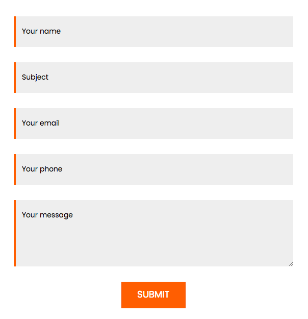
3. Tangy Orange
Looking for something elegant and trendy at the same time? This style just adds that punch of orange to the grey and makes it stand out. Custom CSS class for this style is form-style-3
.form-style-3 .fl-input-group input,
.form-style-3 .fl-input-group textarea {
    border-radius: 0;
    padding: 20px 12px;
    height: auto;
    background-color: #eee;
    margin-bottom: 10px;
    font-size: 14px;
    color: #000;
    border: 0;
    border-left: 4px solid #ff5e01;
}
.form-style-3 .fl-input-group input:focus,
.form-style-3 .fl-input-group textarea:focus {
    border: 1px solid #ccc;
    background-color: transparent;
}
.form-style-3 .fl-input-group input::-webkit-input-placeholder {
    color: #000;
}
.form-style-3 .fl-input-group textarea::-webkit-input-placeholder {
    color: #000;
}
.form-style-3 .fl-input-group {
    margin-bottom: 20px;
}
.form-style-3 label {
    display: none;
}
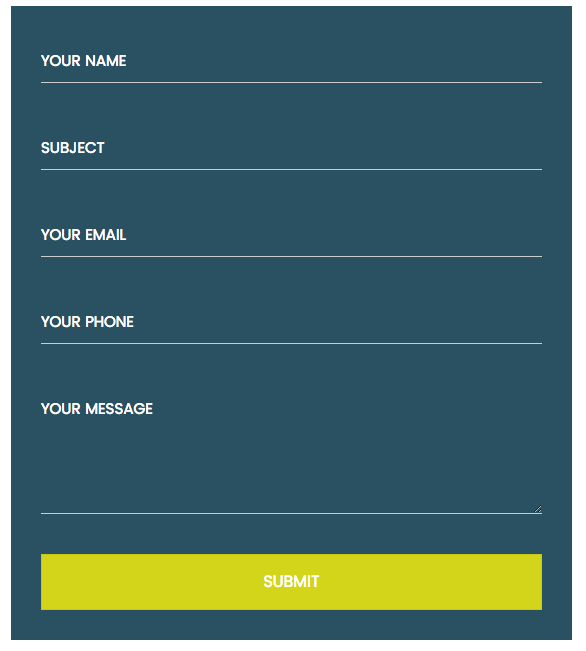
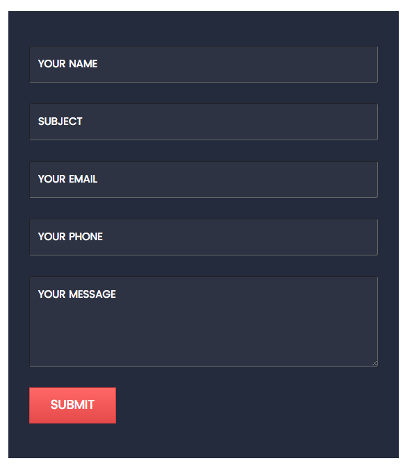
4. Dark Knight
This is a high contrast style with Navy Blue color and a stylish gradient button. It can be a perfect combination for a section with white background. Custom CSS Class for this style is form-style-4
.form-style-4 {
    background: #242b3d;
    padding: 50px 30px;
}
.form-style-4 .fl-input-group input,
.form-style-4 .fl-input-group textarea {
    border-radius: 3px;
    padding: 15px 12px;
    height: auto;
    border-top: 1px solid #222;
    border-left: 1px solid #222;
    border-right: 1px solid #666;
    border-bottom: 1px solid #666;
    background-color: #2d3343;
    text-transform: uppercase;
    margin-bottom: 10px;
    font-size: 15px;
    color: #fff;
}

.form-style-4 .fl-input-group input:focus,
.form-style-4 .fl-input-group textarea:focus {
    border: 2px solid #e44a49;
    background-color: #2d3343;
}

.form-style-4 .fl-input-group input::-webkit-input-placeholder {
    color: #fff;
}
.form-style-4 .fl-input-group textarea::-webkit-input-placeholder {
    color: #fff;
}
.form-style-4 .fl-input-group {
    margin-bottom: 20px;
}
.form-style-4 label {
    display: none;
}
5. Mini LeadGen
How about a form that you can use to grab Emails quickly? It’s always good to get the users to fill up the form fast. This style will do that for you. Custom CSS Class for this style is form-style-5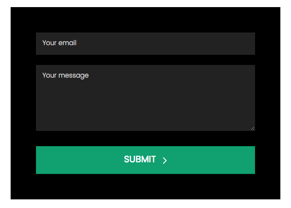
.form-style-5 {
    background: #000;
    padding: 50px;
}
.form-style-5 .fl-input-group input,
.form-style-5 .fl-input-group textarea {
    border-radius: 0;
    padding: 12px;
    height: auto;
    background: #222;
    color: #ccc;
    border: 1px solid transparent;
    font-weight: 300;
    font-size: 13px;
}

.form-style-5 .fl-input-group input::-webkit-input-placeholder {
    color: #ccc;
}
.form-style-5 .fl-input-group textarea::-webkit-input-placeholder {
    color: #ccc;
}

.form-style-5 .fl-input-group input:focus,
.form-style-5 .fl-input-group textarea:focus {
    border: 1px solid #11a070;
    background-color: #222;
}

.form-style-5 .fl-input-group {
    margin-bottom: 20px;
}
.form-style-5 .fl-button-wrap {
    margin-top: 30px;
}
.form-style-5 label {
    display: none;
}
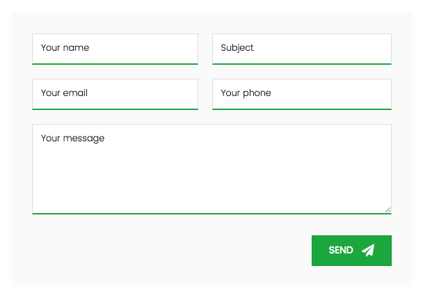
6. Sleek Form
This is a stylish two column design with perfect balance and looks very elegant. Icon on the submit button adds to the style. Custom CSS Class for this style is form-style-6
.form-style-6 {
    background: #fafafa;
    padding: 30px;
}

.form-style-6 .fl-input-group input,
.form-style-6 .fl-input-group textarea {
    border-radius: 0;
    padding: 12px;
    height: auto;
    background: #fff;
    color: #222;
    border: 1px solid #ddd;
    border-bottom: 2px solid #1ba63e;
    font-weight: 300;
    font-size: 13px;
}

.form-style-6 .fl-input-group input::-webkit-input-placeholder {
    color: #222;
}
.form-style-6 .fl-input-group textarea::-webkit-input-placeholder {
    color: #222;
}

.form-style-6 .fl-input-group input:focus,
.form-style-6 .fl-input-group textarea:focus {
    border-bottom: 2px solid #000;
    background-color: #fff;
}

.form-style-6 .fl-input-group {
    margin-bottom: 20px;
    width: 50%;
    float: left;
}
.form-style-6 .fl-input-group:nth-of-type(2n+1) {
    padding-right: 20px;
}
.form-style-6 .fl-input-group.fl-message {
    width: 100%;
    float: none;
    padding-right: 0;
    clear: both;
}
.form-style-6 .fl-button-wrap {
    margin-top: 30px;
}
.form-style-6 label {
    display: none;
}

@media only screen and (max-width: 768px) {
    .form-style-6 .fl-input-group {
        width: 100%;
        float: none;
        clear: both;
    }
    .form-style-6 .fl-input-group:nth-of-type(2n+1) {
        padding-right: 0;
    }
}
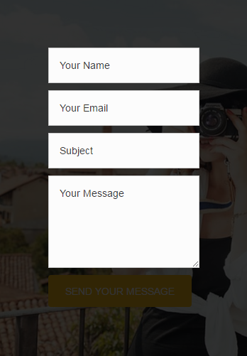
7. Inline Bonanza
Inline, transparent and dark background makes this one a special style for websites with dark color schemes. You can change the background image using the CSS. Custom CSS Class for this style is form-style-7
.form-style-7 {
    background-image: url('http://squeezefunnels.com/wp-content/uploads/2015/09/photographer-407068_640.jpg');
    background-repeat: no-repeat;
    background-size: cover;
    padding: 50px;
    position: relative;
}

.form-style-7:before {
    content: "";
    display: block;
    position: absolute;
    top: 0;
    left: 0;
    width: 100%;
    height: 100%;
    background-color: rgba(0,0,0,0.8);
}

.form-style-7 .fl-input-group {
    margin-bottom: 30px;
    width: 33.33%;
    float: left;
    padding-right: 20px;
}

.form-style-7 .fl-phone {
    padding-right: 0px;
}
.form-style-7 .fl-input-group.fl-message {
    width: 100%;
    float: none;
    padding-right: 0;
    clear: both;
}

.form-style-7 .fl-input-group input,
.form-style-7 .fl-input-group textarea {
    border-radius: 0;
    padding: 12px 15px;
    height: auto;
    background: transparent;
    color: #222;
    border: 2px solid #fff;
    font-weight: 300;
    font-size: 15px;
    text-transform: uppercase;
}

.form-style-7 .fl-input-group input::-webkit-input-placeholder {
    color: #fff;
}
.form-style-7 .fl-input-group textarea::-webkit-input-placeholder {
    color: #fff;
}

.form-style-7 .fl-input-group input:focus,
.form-style-7 .fl-input-group textarea:focus {
    border: 2px solid #e66322;
    background: transparent;
}

.form-style-7 .fl-button-wrap {
    position: relative;
}

.form-style-7 label {
    display: none;
}

@media only screen and (max-width: 768px) {
    .form-style-7 .fl-input-group {
        width: 100%;
        float: none;
        clear: both;
        padding-right: 0;
    }
}
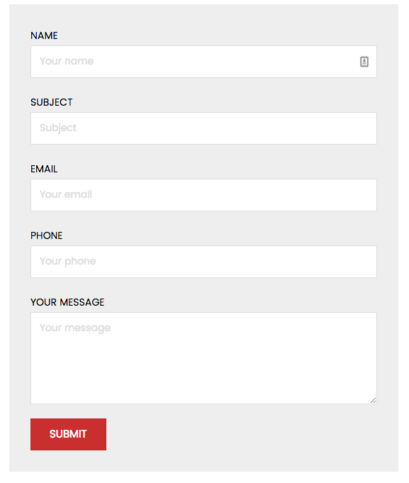
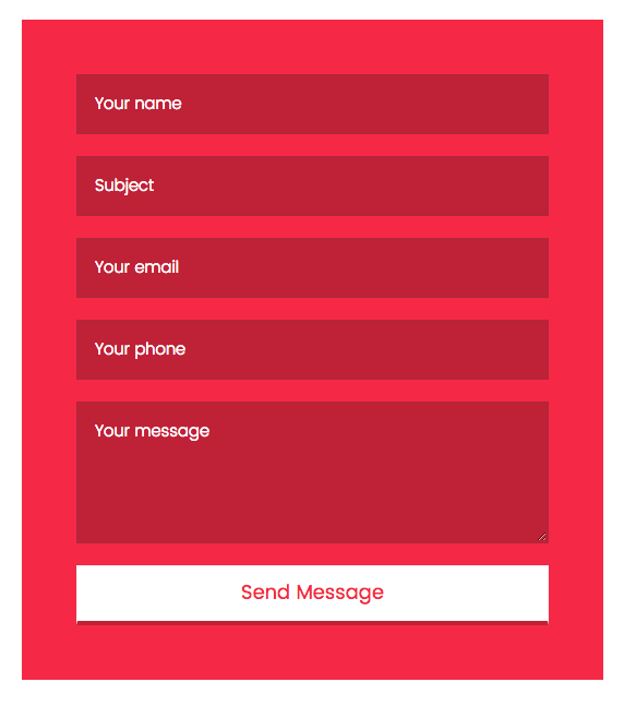
8. Red Hot Red
Need something that truly stands out from the crowd or do you simply love the red color like I do? If yes, then this one’s for you. You can also easily edit the CSS to change the colors. Custom CSS Class for this style is form-style-8
.form-style-8 {
    background: #f52945;
    padding: 50px
}
.form-style-8 .fl-input-group {
    margin-bottom: 20px;
}

.form-style-8 .fl-input-group input,
.form-style-8 .fl-input-group textarea {
    border-radius: 0;
    padding: 15px 15px;
    height: auto;
    background: #bf2136;
    color: #222;
    border: 2px solid #b52539;
    font-weight: 300;
    font-size: 15px;
}

.form-style-8 .fl-input-group input::-webkit-input-placeholder {
    color: #fff;
}
.form-style-8 .fl-input-group textarea::-webkit-input-placeholder {
    color: #fff;
}

.form-style-8 .fl-input-group input:focus,
.form-style-8 .fl-input-group textarea:focus {
    border: 2px solid #f52943;
    background: #bf2136;
}

.form-style-8 label {
    display: none;
}

.form-style-8 .fl-button-wrap a.fl-button {
    border-bottom: 4px solid #bf2136;
}
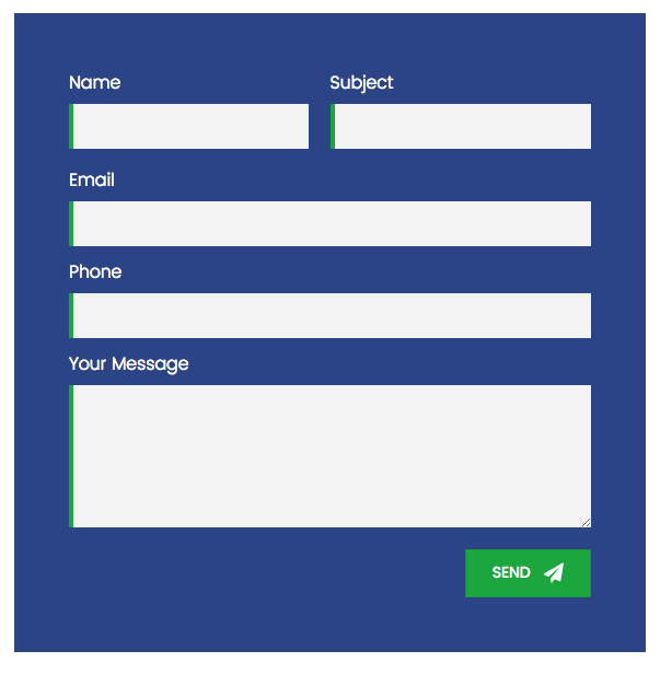
9. Brilliant Blue
Another beautiful style which can be a perfect fit for professional websites like educational institutes, fitness institute, insurance company, health care etc. Custom CSS Class for this style is form-style-9
.form-style-9 {
    background: #2b4486;
    padding: 50px
}

.form-style-9 .fl-input-group.fl-name,
.form-style-9 .fl-input-group.fl-subject {
    margin-bottom: 15px;
    width: 50%;
    float: left;
    padding-right: 20px;
}

.form-style-9 .fl-input-group.fl-subject {
    padding-right: 0;
}

.form-style-9 .fl-input-group input,
.form-style-9 .fl-input-group textarea {
    border-radius: 0;
    padding: 10px 15px;
    height: auto;
    background: #f3f3f3;
    color: #222;
    border: 0;
    border-left: 4px solid #1ba63e;
    font-weight: 300;
    font-size: 15px;
}

.form-style-9 .fl-input-group input::-webkit-input-placeholder {
    color: transparent;
}
.form-style-9 .fl-input-group textarea::-webkit-input-placeholder {
    color: transparent;
}

.form-style-9 .fl-input-group input:focus,
.form-style-9 .fl-input-group textarea:focus {
    border-left: 4px solid #222;
    background: #f3f3f3;
}

.form-style-9 .fl-button-wrap {
    margin-top: 20px;
}

.form-style-9 label {
    color: #fff;
    font-weight: 300;
}

@media only screen and (max-width: 768px) {
    .form-style-9 .fl-input-group.fl-name,
    .form-style-9 .fl-input-group.fl-subject {
        width: 100%;
        float: none;
        clear: both;
        padding-right: 0;
    }
}
10. Fancy Form
Purple submit button and a dark background makes this form stand out. You can use this kind of styling for funky websites like Fashion, Clothing, Play School, Halloween etc. Custom CSS Class for this style is form-style-10
.form-style-10 {
    background-image: url('http://squeezefunnels.com/wp-content/uploads/2015/08/200x319.png');
    background-repeat: no-repeat;
    background-size: cover;
    padding: 50px;
    position: relative;
}

.form-style-10:before {
    content: "";
    display: block;
    position: absolute;
    top: 0;
    left: 0;
    width: 100%;
    height: 100%;
}

.form-style-10 .fl-input-group {
    margin-bottom: 20px;
}

.form-style-10 .fl-input-group input,
.form-style-10 .fl-input-group textarea {
    border-radius: 0;
    padding: 12px 15px;
    height: auto;
    background: #f3f3f3;
    color: #222;
    border: 2px solid transparent;
    font-weight: 300;
    font-size: 15px;
}

.form-style-10 .fl-input-group input::-webkit-input-placeholder {
    color: transparent;
}
.form-style-10 .fl-input-group textarea::-webkit-input-placeholder {
    color: transparent;
}

.form-style-10 .fl-input-group input:focus,
.form-style-10 .fl-input-group textarea:focus {
    border: 2px solid #872097;
    background: #f3f3f3;
}

.form-style-10 .fl-button-wrap {
    position: relative;
    margin-top: 40px;
}

.form-style-10 label {
    color: #fff;
    font-weight: 300;
    text-transform: uppercase;
}