Every editable element on a page, whether a row, column or module, has an Advanced tab in its settings panel. The Advanced tab allows you to edit a set of settings that are common to all elements and a few that are specific to only rows, columns or modules.
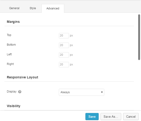
Margins
Margins are spacing on the outside of an element. It allows you to set the top, bottom, left, and right margins for an element.
Padding (Rows and Columns Only)
Padding is the spacing on the inside of an element. It allows you to set the top, bottom, left, and right padding for an element.
Responsive Layout
The Responsive Layout settings is where you choose how an element will appear at different screen sizes.
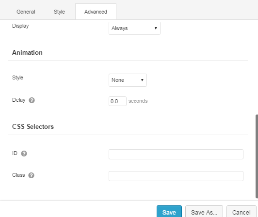
Display
This settings allow you to choose which size devices an element will be visible on. For example, if Display is set to Large Devices Only, the element will only be visible on desktop computers or TVs with a browser. If it’s set to Small Devices Only, the element will only be visible on most phones.
Medium Device Width (Columns Only)
This setting allows you to set the percentage based width of a column at the Medium Device Breakpoint found under Tools > Global Settings. Set it to Custom if you would like to enter a custom width.
Small Device Width (Columns Only)
This setting allows you to set the percentage based width of a column at the Small Device Breakpoint found under Tools > Global Settings. Set this setting to Custom if you would like to enter a custom width.
Stacking Order (Columns Only) (Beta)
This setting allows you to reverse the order columns are stacked on smaller devices.
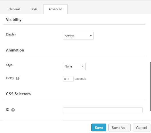
Visibility (Beta)
This setting allows you to choose if an element should be visible based on if a user is logged in, logged out, or never (only visible while editing).
If only show an element when a user is logged in is chosen, you will be presented with a field for entering a capability the user must have in addition to being logged in. For more info on capabilities please see this WordPress Codex article.
Animation (Modules Only)
This settings allows you to animate a module when it is scrolled into view on a page. You can choose the Style of the animation as well as setting a delay for how long the builder should wait before running the animation.
Please Note: Animations aren’t currently supported on iOS devices.
CSS Selectors
This allows you to enter custom selectors to be used to target specific elements in your CSS code.
ID
This is a unique ID applied to an element. It must start with a letter and contains only dashes, underscores, letters or numbers (no spaces).
Only one element per page must have a specific ID. For example, if I give one element the ID of my-element, no other element on the page should use that ID. If you need to target groups of elements, consider using the Class setting instead.
Once you have an ID set for your element (e.g. my-element), you can target it with CSS like so…
#my-element { text-align: right; }
Keep in mind, IDs in your CSS should start with the pound (#) sign, but it should not be entered into the settings for an element.
Class
Unlike the ID selector, the Class selector does not have to be unique and can be used to target multiple elements on the page. It must start with a letter, contain no spaces but only dashes, underscores, letters or numbers.
Once you have a Class set for your element(s) (e.g. my-elements), you can target it/them with CSS like so…
.my-elements { text-align: right; }
Keep in mind that Classes in your CSS must start with a dot (.), but it should not be entered into the settings for an element.
Pro Tip:Multiple classes can be entered by separating them with spaces.