
The Menu module can give you more options for menu content, style, and layout. It also gives you the ability to insert a menu anywhere in your layout. Here are some ideas:
- Suppress the theme's header and footer and use Page Builder to construct your own header and footer by creating row layouts that could include a Menu module. Save the header and footer as rows and use them on any page in your site. Global rows keep the content synched across pages, standard rows insert the content but let you change it for each page.
- Use the theme's standard header with menu, then create a footer row with a Menu module that uses a different menu.
- Save a Menu module and use it in shortcode in a text widget. There's a Custom Menu widget in WordPress, but the menu module gives you more control over styling without resorting to CSS.
Choose menu layouts
The module has four different menu layout options. For the first three options, you have a choice of an arrow or plus sign to display the submenu.
- Horizontal
A standard horizontal layout that supports dropdown submenus, with a choice of down arrow, plus sign, or nothing. These two screenshots show horizontal menus with an arrow for the submenu.


- Vertical
A vertical layout that has support for submenus that fly out to either the left or right of the menu.

- Accordion
A vertical accordion layout that displays sub-menus inline when the toggle icon is clicked. -
- Note that with accordion layout, submenu opacity background is 100%, no matter how it's set on the Style tab.

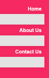
- Expanded
Expanded layout is similar to the WordPress Custom Menu widget. Top-level menu and sub-menu items are displayed in an unordered list style format.
Style everything
Use the Style tab of the Menu module to create unique menu designs with style options:
- Left, center, or right alignment of main menu items
- Show or hide a drop shadow on the sub-menu box
- Text link and hover color
- Font size, format (uppercase, lowercase, caps), and weight (normal, bold, light)
- Horizontal and vertical spacing between links
- Menu background color and opacity
- Sub-menu background color and opacity
- Background hover color
- Show or hide separators between menu items, set separator color and opacity
Notes: The font-family is what you defined for page content in Customize > General > Text and cannot be customized on the Style tab. By default, the menu link colors appear in the color you defined in Appearance > Customize > General > Accent Color, and you can customize this color.
Style options for mobile devices
The Mobile Style option on the General tab has the following settings:
- Expanded
The menu will not collapse and all of the menu items will show in an un-ordered list style format. - Hamburger Icon
The menu collapses as the screen becomes smaller, and a hamburger icon (horizontal lines) toggle button appears. - Hamburger Icon + Label
The menu collapses as the screen becomes smaller, and a hamburger icon toggle button plus the word MENU appears. - Menu Button
This option displays a button labeled MENU,